Max Palm - Tech Blog
This is a project I did for Max via Introvert.Design. He wanted a website where he could write down his thoughts and solutions around technology. He didn't have a brand identity or a website before, so we started from zero. My role was to design the UI/UX and code the site, which meant building his brand identity first, then using it to build the website.
Brand Identity
Max wanted his initials as his logo, MP, for Max Palm.
Building a brand identity is the hardest part of my work. Sometimes I get too many ideas and struggle to choose one. Other times I get none at all. This time, I got none. So I went back to what Max's work is about: cybersecurity and photojournalism. I needed a visual identity flexible enough to fit both worlds, without drifting too far from who Max actually is.
My first idea was runic writing, inspired by how the word "Bluetooth" comes from a Viking king's name. I dropped that quickly. It would have needed real research into runes, and the logo risked being hard to remember. So instead, I played with the letters M and P styled in a way that echoed that runic feel.
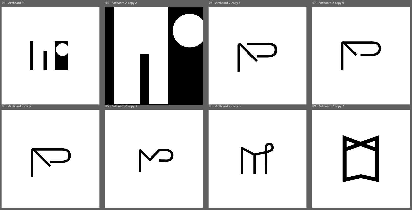
MP logo sketch
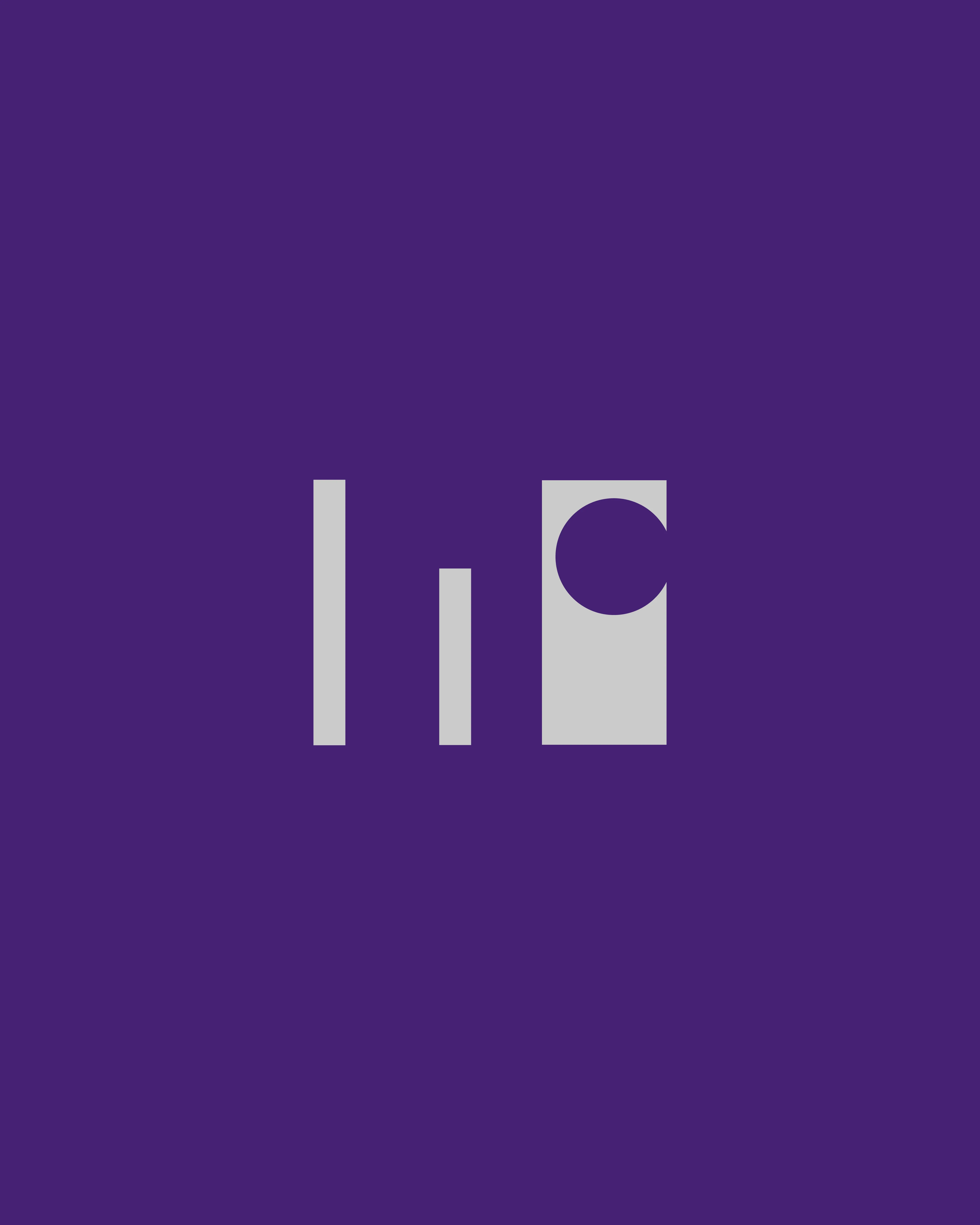
From there, the idea shifted to pictograms that still read as M and P, combining tech and camera imagery. I started with the M, thinking about connection and network. I used the three bars from a signal strength icon to form the M. The third bar is slightly wider, so it forms both the P and a camera lens at the same time. There was a lot happening in that one mark, so I kept pushing it to be as minimal as possible without losing MP.
When Max saw the design, he chose the MP pictogram version.
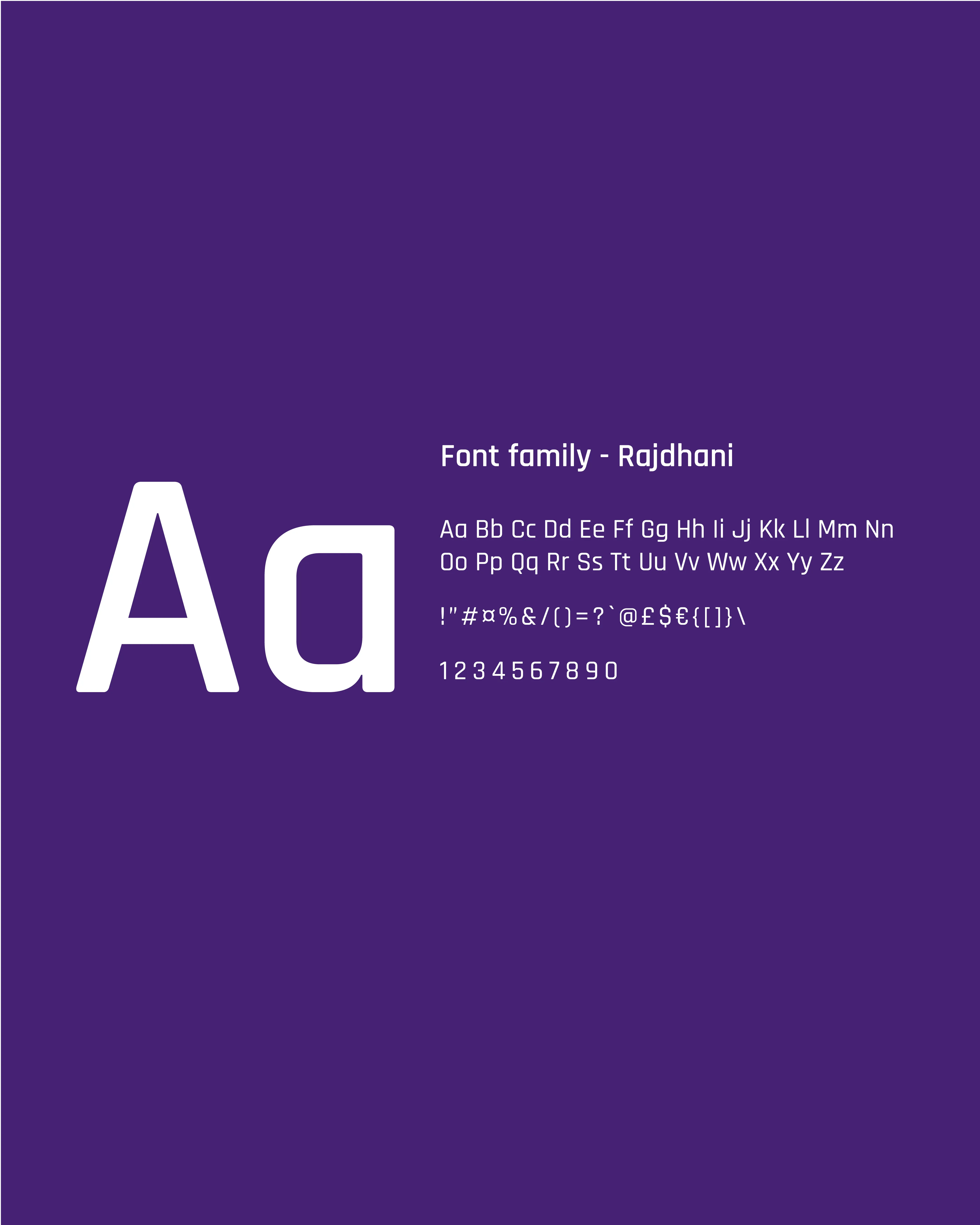
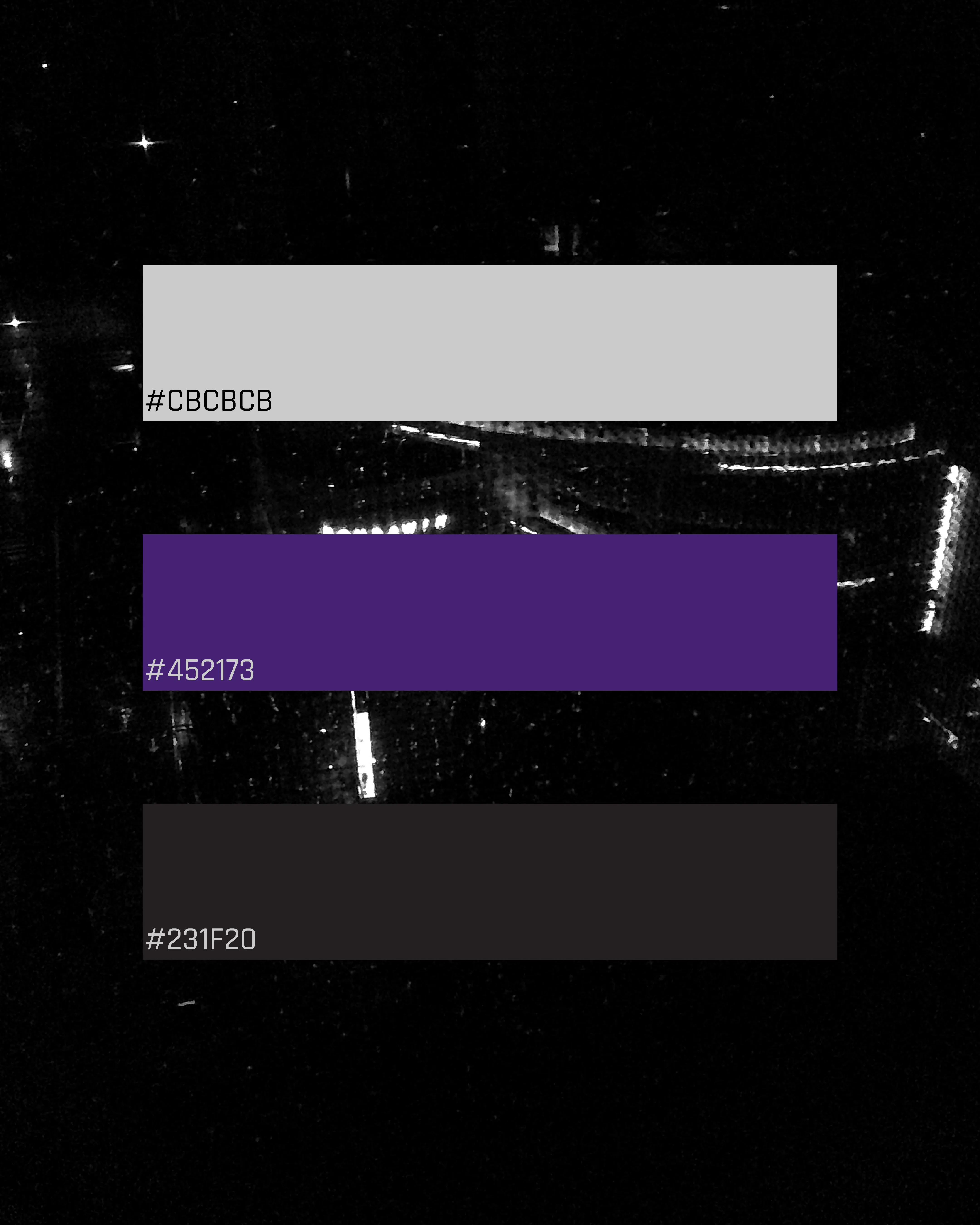
From there, I built out the rest of the brand identity. Max wanted things simple, just black and white. I felt it needed a bit of color, and he chose purple. I also added grey, since a black and white photo naturally includes shades of grey too.
Website
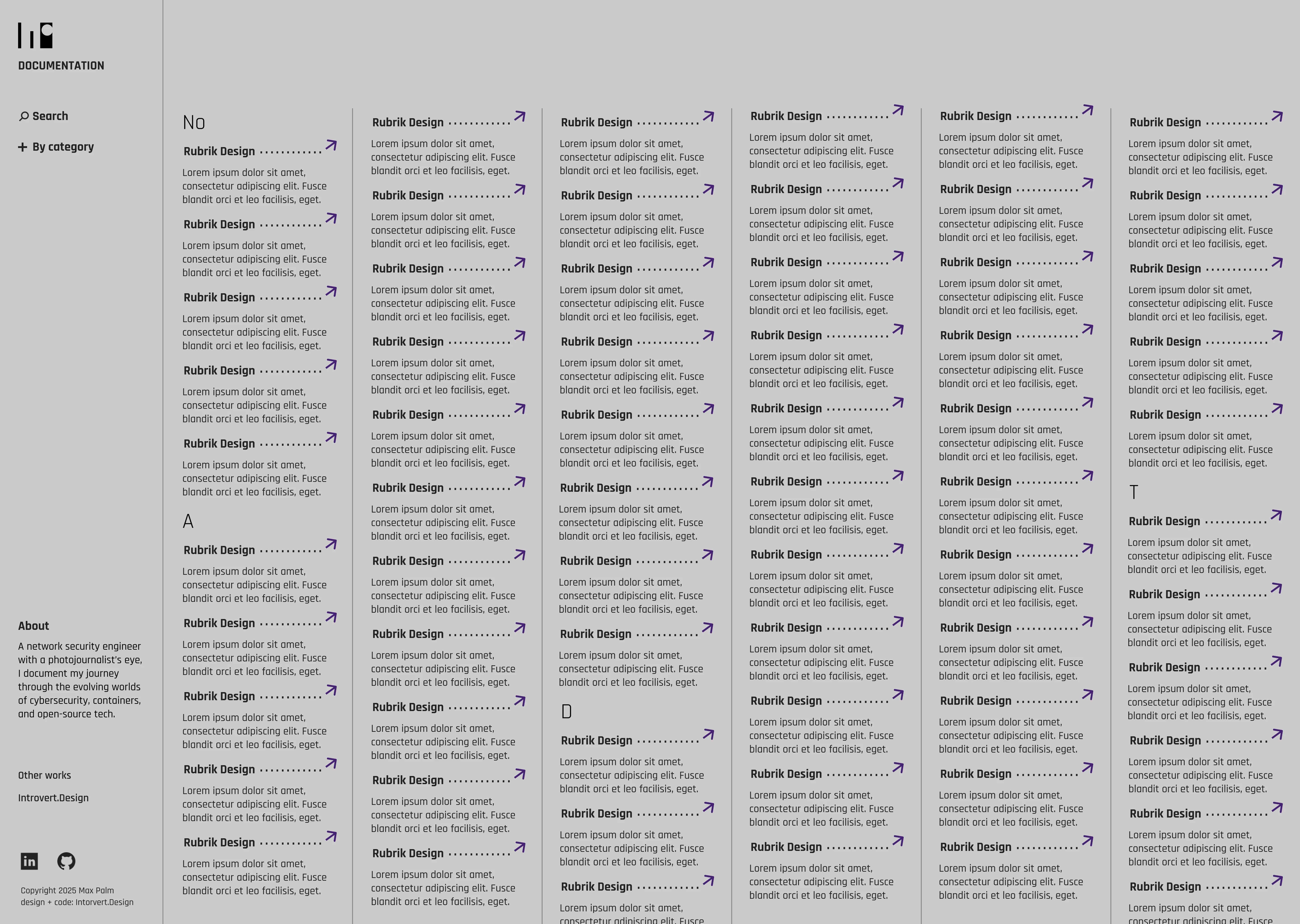
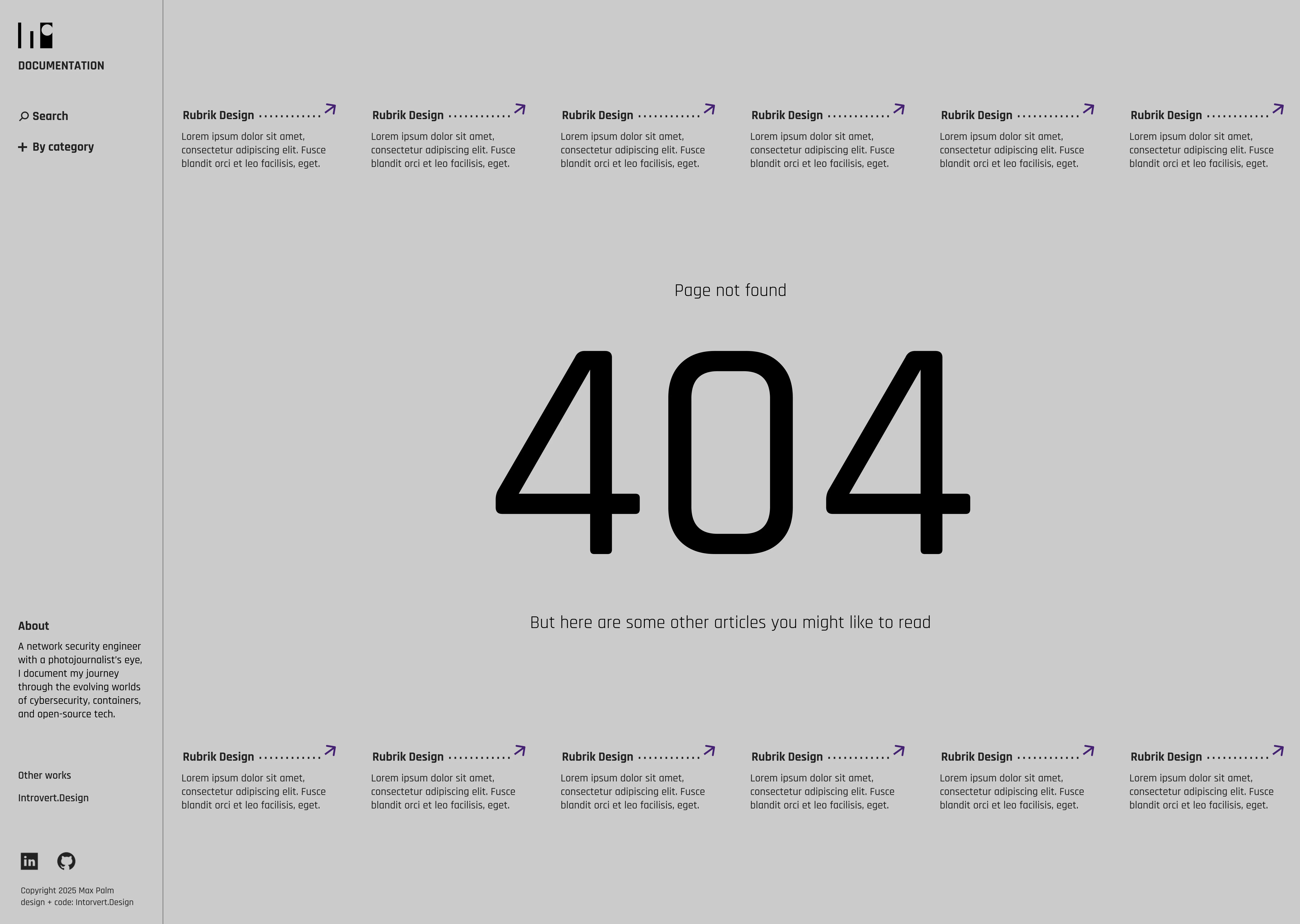
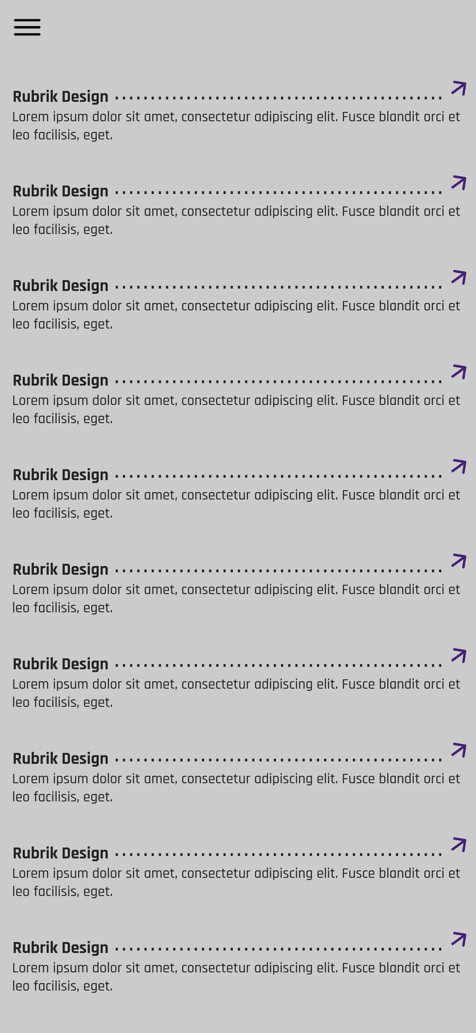
"Simple, an archive, easy to find things." That's how Max described the site he wanted, in three words and one sentence. His blog posts were meant to feel like articles.
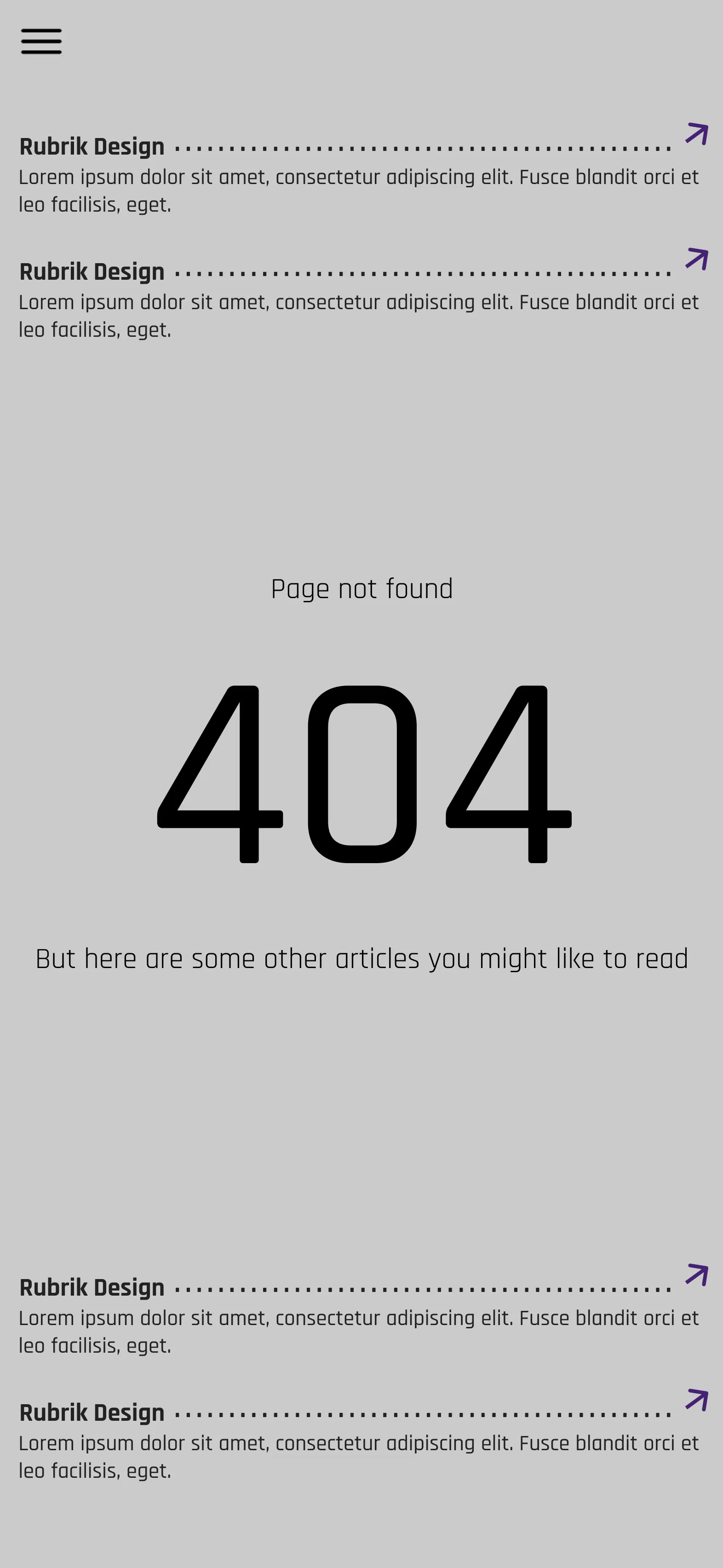
I got the idea from e-commerce sites that list every brand they carry on one page. Sorting the articles by the first letter of the title made them easy to archive and easy to find if you already know what you're looking for. For anyone who doesn't, I added a search function.
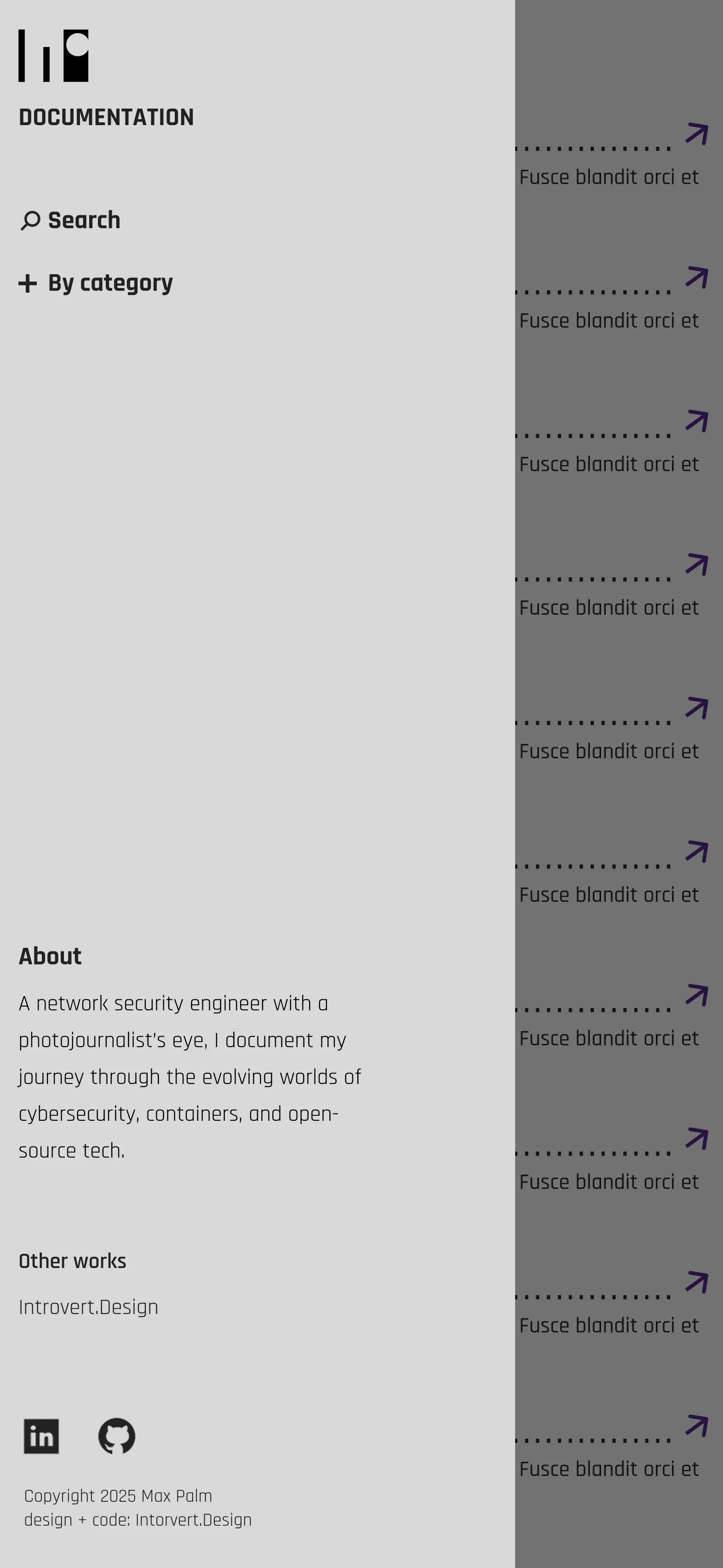
Max wanted less focus on himself and more on his articles, and he didn't want the usual pages like About, Contact, Home, and Articles. I solved this with a side panel on the left, where visitors can filter, search, and read a short bit about Max.
I used purple as the accent color and grey as the background, with black and white for the text.
Search and filter logic wasn't something I'd built before, so I used this project as a chance to learn Claude Code. I prompted my way through building those functions, and got them working the way the site needed.
The site is live now, and gave Max a professional presence and a place to publish his writing that he didn't have before.
"I'm super happy with the website." — Max Palm
- Owner of the website: Max Palm
- Design and coded: Chattria T. Palm, Introvert.Design
- Brand Identity
- UI/UX
- Fullstack Development